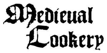
Last week I went to see the movie, "Avatar". On the whole it's a pretty good film (read: an overdone plot done very very well), however I was continuously thinking about my website for almost the entire film. Why? Because of the subtitles. Cameron used the same freakin' font - Papyrus for the movie's subtitles as I've been using on my website for years.
Way back when I started the site, I chose Papyrus because it was attractive, vaguely medievalish, and was relatively unknown - especially compared to all the "Ye Olde English" fonts. More and more over the past few years I've been seeing it everywhere. It's on menus and signs and t-shirts and even packaging for socks. Some in the graphic design business now feel that Papyrus is overused.
This gives me just that much more encouragement to replace it on my site. Now of course the question is, what do I use in its place? I'd prefer something with a little historic accuracy, but it also has to be readable (I found a really nice reproduction of a 14th century script, but it's hard for even me to read and I'm a language geek).
One option is to choose a font similar to medieval blackletter calligraphy.
Blackletter
Manuskript Gotisch
1454 Gutenberg Bibel
1456 Gutenberg
1492 Quadrata Lim
Then there are some fonts that are more script-like.
Cantzley AD1600
Cardinal
Gotische Minuskel
Gotyk Poszarpany
Magna Carta
For the moment I'm leaning towards 1456 Gutenberg or Magna Carta. I'll have to do a couple test pages to see how they look.


6 comments:
I vote Cardinal, just because it's slightly spiffy looking, like Papyrus, but it's still super readable.
I'm a Cantzley AD1600 fan, but Gotische Minuskel looks closest to what I've seen in handwritten Portuguese (Azorean) parish registers from the 1500s. If you use it, you'll get that authentic look-- all you'll have to do is make sure it's small and cramped and spotted with mold, and it'll be a dead ringer! Unfortunately if you use it, it'll make your site as difficult to read as those registers.
My top three in order are:
Blackletter
1492 Quadrata Lim
Magna Carta
Whatever you do don't use Cardinal. It's the new papyrus, it's popping up on medieval style blogs everywhere. People like it because it's medievalish but still fully readable, in about six months you'd have to change again.
Blackletter just looks cool, as does Quadrata Lim. Magna Carta is nice, but it wouldn't stand out as nicely for titles.
If it were me, I'd go w/ Cardinal, simply because it's easier to read.
I'm leaning toward Cardinal as it seems cleaner and easier for these old eyes to read.
All the fonts are beautiful but I like Cardinal best for the graphic purpose. Great blog by the way, I look forward to following with great interest, Lois x
Post a Comment